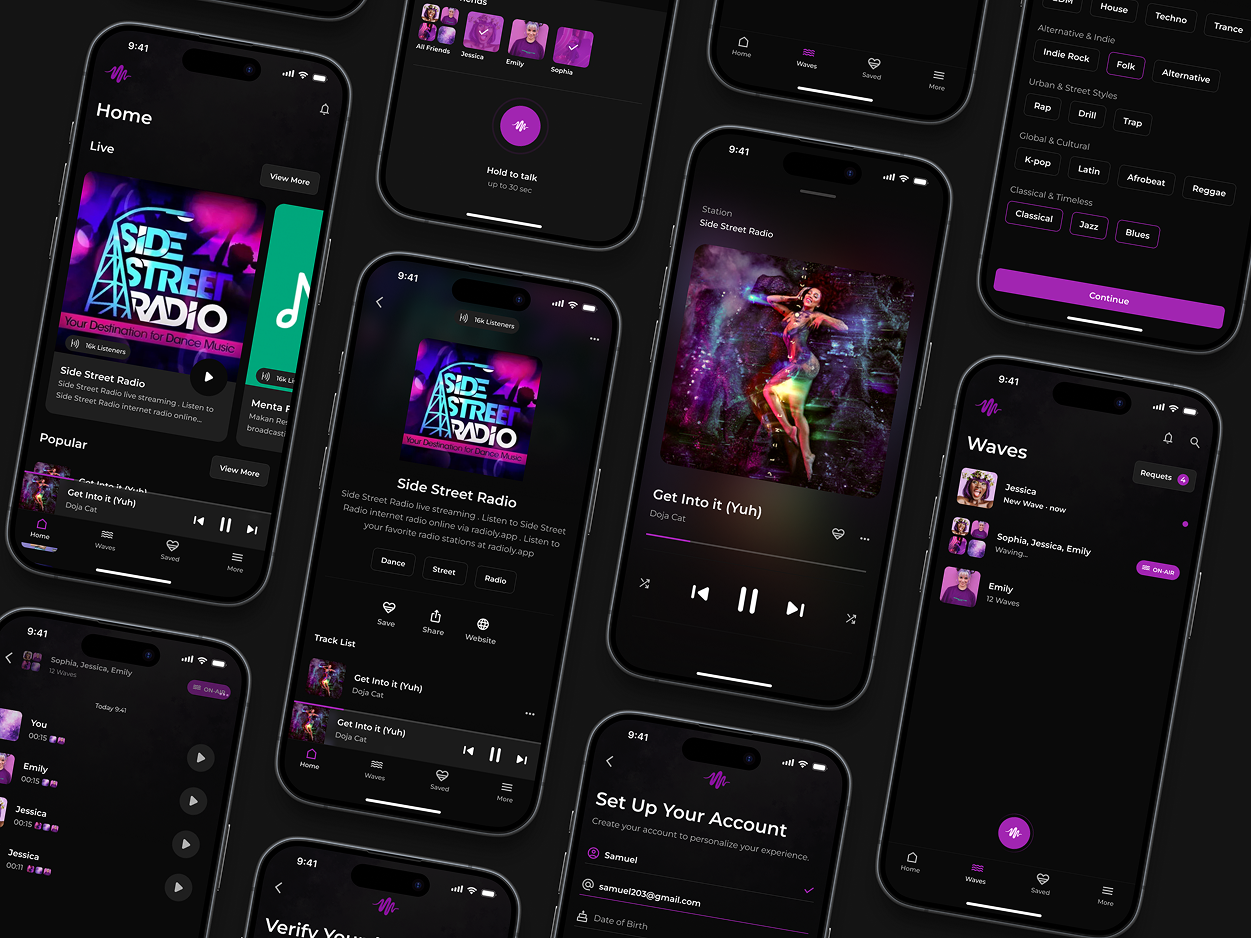
I created this app interface since the majority of current music apps are either too large, too feature-rich, or too cluttered. This idea is for individuals who only want to tune in and listen without any interruptions.
What makes it different:
It focuses on being simple. At night, a pleasant black theme looks clean. Large, simple-to-read station cards. Just play, pause, and switch, no sophisticated menus or difficult flows.
Design decisions that matter:
The dark UI helps the material stand out and eases eye strain. I made buttons with a lot of contrast and used type that was easy to read so that people could get around quickly. Navigation is bottom-based and therefore simple to operate with one hand. The design works effectively with various forms of content, including music, talk radio, and podcasts, without compromising the experience.
Though not live now, this idea reconsiders the potential for a radio app to be simple, minimalist, and user-friendly.